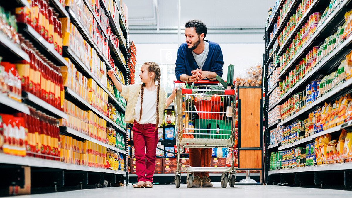
Fresh produce at the entrance primes customers to buy non-essential 'treats' later on
Customers make more impulsive and emotional purchase decisions after 23 minutes in the supermarket
Our brains are 'wired' to respond to special offers and we get a little hit of dopamine when we think we've got a deal
The trolleys seem to be getting bigger, the eggs are elusive, and the first thing inside the entrance is the squashable fruit and veg – which would surely be better placed on top of everything at the end.
Not according to the vast amount of research underpinning the way your local supermarket is laid out. When you shop at Coles, Woolworths, ALDI, or even some of the smaller supermarket chains, every detail has been designed to make you spend more.
From how many minutes it takes before you start buying on impulse, to which shade of yellow you like best for bananas – it’s all been studied by consumer psychologists and fed into supermarket design.
Understanding these tricks and traps can really help you save money. We take a look at some of the common ploys used to make us feel good and spend big.
A fresh start
The fruit and veg zone is nearly always the first thing you encounter in a supermarket. In simple terms, it’s there to make you feel good. If you feel good, you’re likely to buy more throughout the store.
“Consumer research tells us we associate green with freshness, health and vitality,” says Jana Bowden, professor of marketing and consumer behaviour at Macquarie University. “Fresh vegetable displays are geared towards encouraging consumers to feel good about their lifestyle choices.
“Also, buying fresh, nutritious produce early in the shopping trip acts as a sort of approval to cart more ‘guilty pleasure’ foods such as snacks and confectionery later on. These, of course, are often higher-priced products.”
Buying fresh, nutritious produce early in the shopping trip acts as a sort of approval to cart more ‘guilty pleasure’ foods such as snacks and confectionery later on
Prof. Jana Bowden, Macquarie University
Another key feature of the fresh food zone is the open-plan layout, with varied flooring and lighting. There might be an on-site bakery, and fish, meat or deli counters.
“It’s about creating a market-like feel,” says Dr Paul Harrison, consumer psychologist and senior lecturer at Deakin University. “It feels as though we’ve visited several different stores rather than a single big shop. And areas such as the bakery give the impression the supermarket is trustworthy. It’s like they’re saying, ‘You can trust us because we make stuff’.
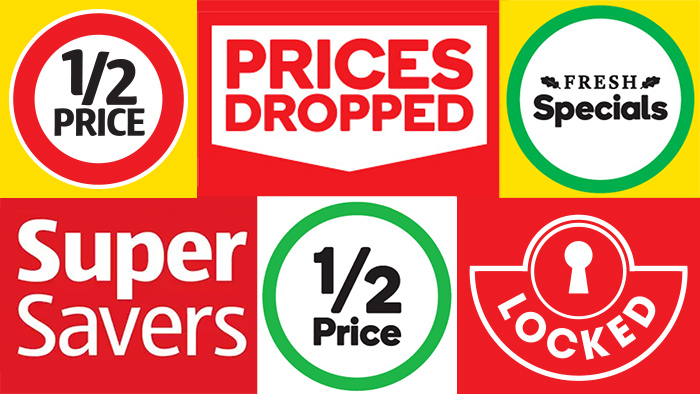
Special offers entice us to buy on impulse or buy more.
End caps and nudges
Once you have your fruit and veg on board, it’s time to push on into the aisles. Studies of shoppers using GPS trackers show we’re most likely to walk the perimeter, ducking into some aisles and skipping others.
This means those end-of-aisle displays – called ‘end caps’ – are big business for supermarkets. They can sell up to eight times better than items on regular shelves.
Brands pay a premium to place their products here. And it’s under those yellow and red ‘specials’ signs that our good intentions may come undone.
It’s human nature to be attracted to a bargain. It also feeds into a theory known as the scarcity effect
Paul Harrison, Deakin University
“Offers like buy one get one free, cashback offers, free sample offers and bonus items are ‘nudge’ tricks,” says Bowden.
“They get us to impulse-buy or buy more in order to qualify for the deal – and when we get a deal, we get a temporary shopper’s dopamine high.”
Unfortunately, even the most savvy shopper is vulnerable to the ‘nudge effect’ of a special.
“It’s human nature to be attracted to a bargain,” says Harrison. “It also feeds into a theory known as the scarcity effect. This is where we think that if it’s on special, then it must only be available at this shop or for a short time, and we afford it more value than the products around it.”
Research shows if you can get a customer in for five or 10 minutes they spend more per minute than a customer who’s in for 30.
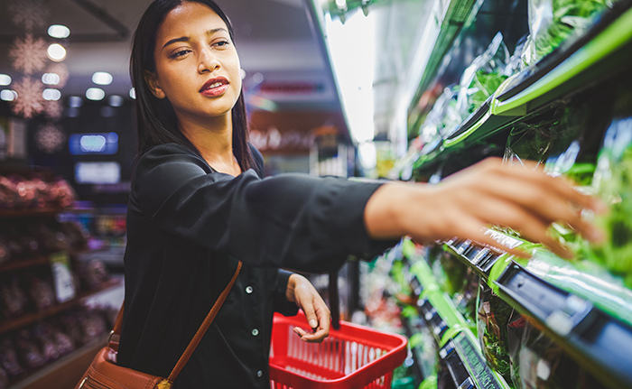
Another subliminal ‘nudge’ used at the supermarket is colour.
Billy Sung is professor of consumer psychology and neuroscience at Curtin University. He says colour psychology is complex, and colour association depends on factors such as where we grow up, and our culture.
But there is some consensus. “We know that products packaged in green are more likely to be deemed environmentally sustainable,” he says. “And black and gold together signifies an item is luxurious or premium.”
Products packaged in green are more likely to be deemed environmentally sustainable, and black and gold together signifies an item is luxurious or premium
Prof. Billy Sung, Curtin University
He says red and yellow is used for signage not because it stimulates hunger, as once thought, but because it’s eye-catching, and we’re now conditioned to associate it with a bargain.
Colour theory is applied in myriad other ways. Bowden explains that some years ago, research was done on which shade of yellow was most favoured by shoppers buying bananas.
“Shoppers prefer Pantone 12-0752, or Buttercup yellow, as opposed to Pantone 13-0858 Vibrant Yellow,” says Bowden.
Naturally, some banana farmers adjusted the timing of their crops to nail the right shade.
Text-only accessible version
6 ways to save money at the supermarket
Take a list
Be specific! Sung recommends you write ‘one litre of orange juice’ instead of ‘orange juice’. It might help you resist a special on a bigger product you don’t need.
Choose a smaller trolley
Sometimes, you need a big one. But if in doubt, go small. “A large trolley gives us psychological permission to cart more,” says Bowden.
Be careful of BNPL
Sung cautions against using buy now, pay later (BNPL). Research shows that the pain we normally feel when paying for something with cash is much reduced when paying with a credit card, and with BNPL, it’s so abstract to the brain, we feel virtually nothing.
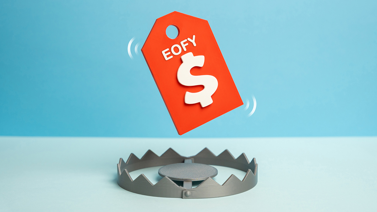
Research deals across supermarkets
Bowden suggests you go for a deal if it’s on a product you normally buy, and it’s good enough that you’ll be ahead in the long run. Use unit pricing to ensure you’re getting bang for your buck.
Avoid shopping if you’re feeling excited… or sad
High emotion, whether it’s positive or negative, has been proven to make us buy more stuff we don’t need.
Use unit pricing
Unit pricing helps you compare value for money, as buying in bulk is not necessarily always the cheapest option.
Read my mind
One of the hot research trends is using technology to objectively measure our responses and decision making.
As the research lead at Curtin’s Consumer Research Lab, Sung works with volunteers hooked up to things such as eye-tracking glasses. Supermarkets can use data on where we tend to look to work out where to display the most lucrative items.
“90% of our research is done in the lab, in an artificial environment, in front of a monitor to mimic it, or VR,” says Sung.
“If we’re doing it in the field, we use eye-tracking glasses. They allow us to track where people are looking and the size of the pupil. That tells us how much cognitive processing is going on.”
With volunteers hooked up to things such as eye-tracking glasses supermarkets can use data on where we tend to look to work out where to display the most lucrative items
Biometric wristbands can also be worn to measure the sweat level and heart rate of shoppers, revealing how interested they are in a product or marketing material. Even the intent to buy can be measured from brainwave headsets.
Meanwhile, other research continues on the role strong emotions play in what we buy.
“There’s research to show that people who are excited generally spend more money,” Sung says. “Feeling sad can lead us to pay more for an item, or to eat unhealthy food. In general, any kind of heightened emotion – whether it’s positive or negative – makes us more likely to spend more.”
So, where are those eggs? Whichever aisle they’re in, they’re probably in the middle, with other popular products.
Splitting up the staples, such as bread, milk and eggs, and placing popular items mid-aisle are classic supermarket tricks. Apart from exposing us to further temptation, it slows us down.
Splitting up the staples, such as bread, milk and eggs, and placing popular items mid-aisle are classic supermarket tricks
This works very well for the supermarket, especially as it appears there’s a burnout point at which we start buying with our heart instead of our head.
“Using functional magnetic resonance imaging (fMRI) of shoppers’ brains, research has found that after about 23 minutes of supermarket shopping, consumers hit a mental ‘burnout’ wall,” explains Bowden.
“Decision-making shifts from being cognitive and thought-based to much more reactive, impulsive and emotional. And after 40 minutes of shopping, consumers’ brains tune out to rational thought.”
The quick shop
If the customer who stays a long time is a boon for the supermarket, there’s another type of shopper who’s even more valuable.
“Research shows if you can get a customer in for five or 10 minutes they spend more per minute than a customer who’s in for 30 minutes or so,” says Harrison. “The high-value customer is the short-visit customer.”
Supermarkets are responding to this with design tweaks, such as more self-checkouts, to get people in and out as fast as possible. Proponents claim it’s efficient for the customer, and cheaper for the supermarket.
The high-value customer is the short-visit customer
Dr Paul Harrison, Deakin University
“The old idea that you stick the milk at the back isn’t necessarily the case now,” says Harrison. “Smart supermarkets are putting a limited selection of bread and milk at the front of the shop, and a more extensive selection at the back.”
And beside those ‘quick grab’ essentials, they’re positioning premium items that are really about convenience and solving a problem.
“They put different problems together and help people fix them,” says Harrison. “Ready to go items, premium stuff, something a bit exotic, things in baskets… There are big margins in premium products, and it’s all about margins. If you can get most people to spend even 10 cents more, you’re making a lot of money.”
As a longstanding CHOICE subscriber, I'm delighted to be contributing now as a
freelance writer, producing the sort of stories I've gobbled up over the years.
I love
raking over a topic with experts and weaving their insights into good, plain writing with practical takeaways. It's very satisfying being part of an editorial team that has
rigour, impartiality and independence at its core.
For more than 60 years, CHOICE has been fighting the good fight for Australian consumers.
In the past year alone we've uncovered systemic issues with sunscreens, investigated shonky supermarket pricing, fought for stronger scam protections and helped make complex energy pricing fairer and clearer.
CHOICE is here to provide unbiased advice and independent testing in our world-class labs. We buy the products we test, just like you do, and our expert reviews are influence free. We’re here to help you choose smarter. Hopefully you’ll also save some money along the way.
Thanks to CHOICE, you’ll never be alone when a business treats you unfairly. You can support our work by joining or donating to our cause.